project summary
I was tasked to develop a personal brand identity that can be used for an online portfolio or social media by applying guidelines for graphic design and logo design, and exploring ideas of consistency in branding.
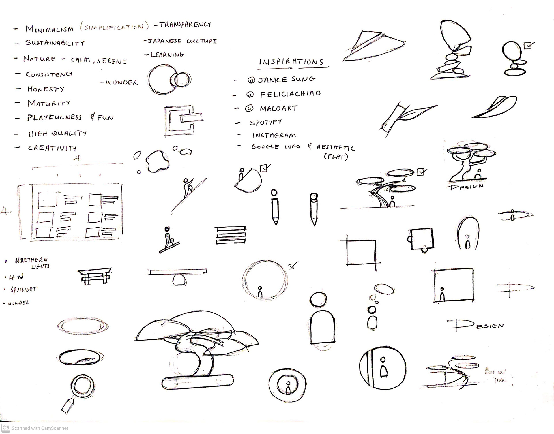
Personal Values
These were listed to allow clear identification of the values I wanted my brand to embody. These values were:
MINIMALISM
CURIOUSITY
LEARNING FROM NATURE
FRIENDLINESS
CONSISTENCY
SUSTAINABILITY
CREATIVITY
OPEN MINDEDNESS
MOODBOARD
I identified some aesthetic and characteristic inspirations from other brands and artists to potentially inform the look and feel of the final design.
Most of the inspirations are artworks that I liked the feelings they conveyed to me, such as elegance, calmness, simplicity, and friendliness

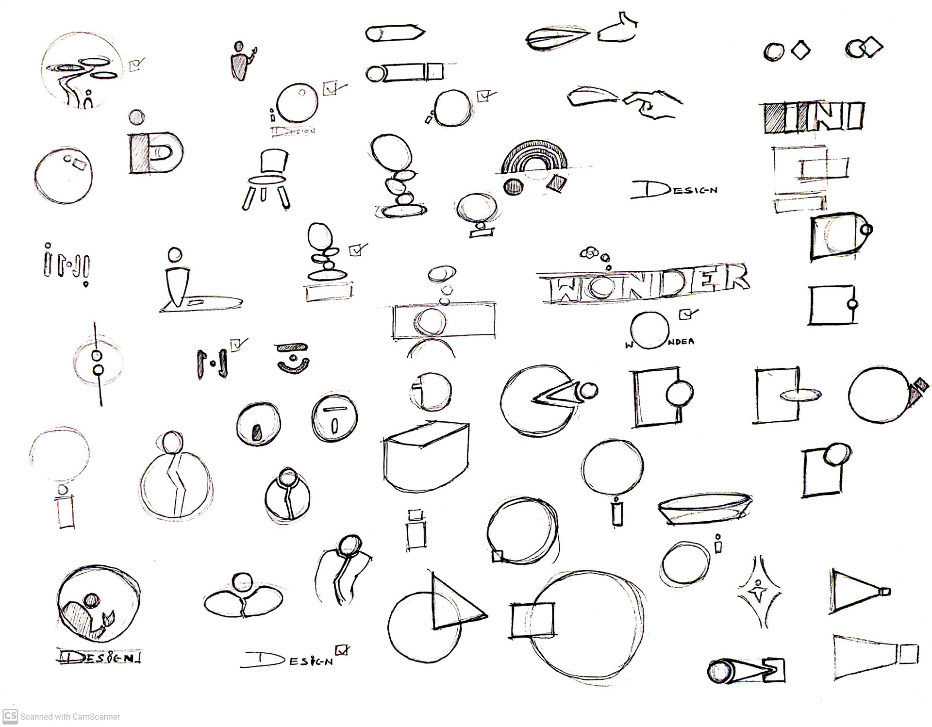
IDEATION
After identifying some aesthetic and characteristic inspirations from other brands and artists, I began ideations of logos through sketching and quick digital icons to begin to try to capture my version of the values I wanted.
These ideas played with my initials, and themes relating to my values.
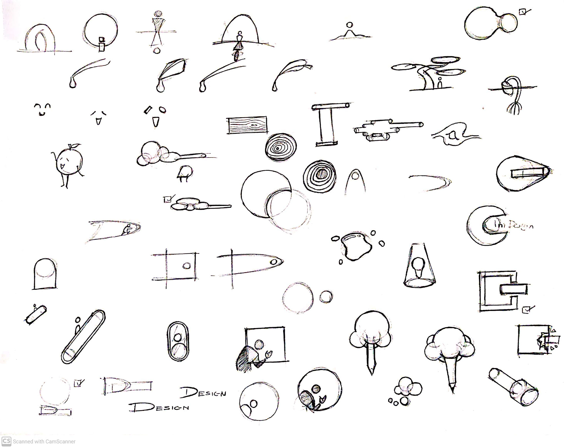
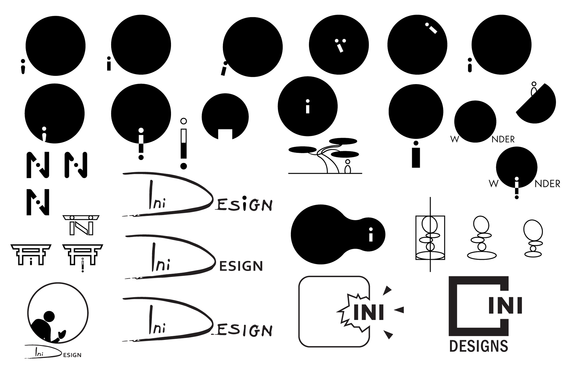
digitization and development
After Identifying some ideas that had the desired aesthetics and values, they were digitized and developed on Adobe Illustrator. I selected a few of the logos I liked best to move forward, then played around with fonts and their positioning and formats.
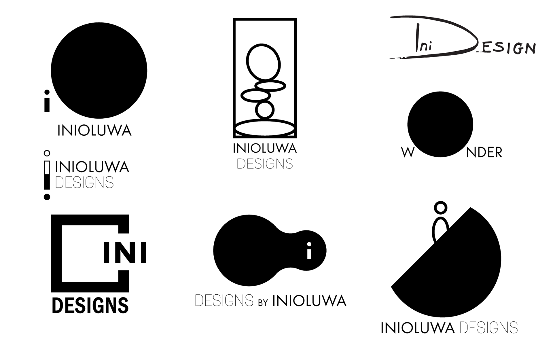
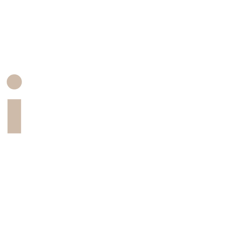
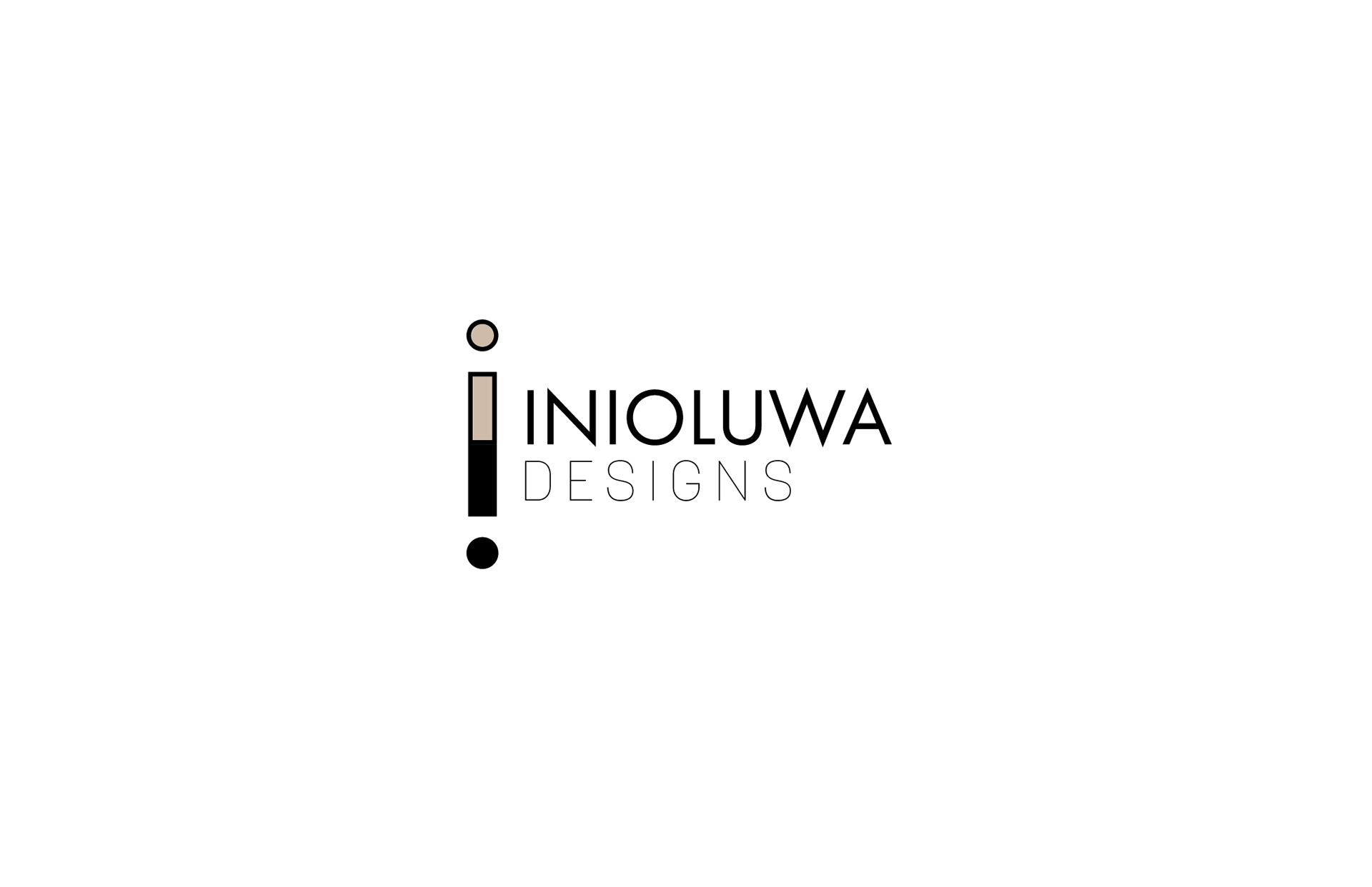
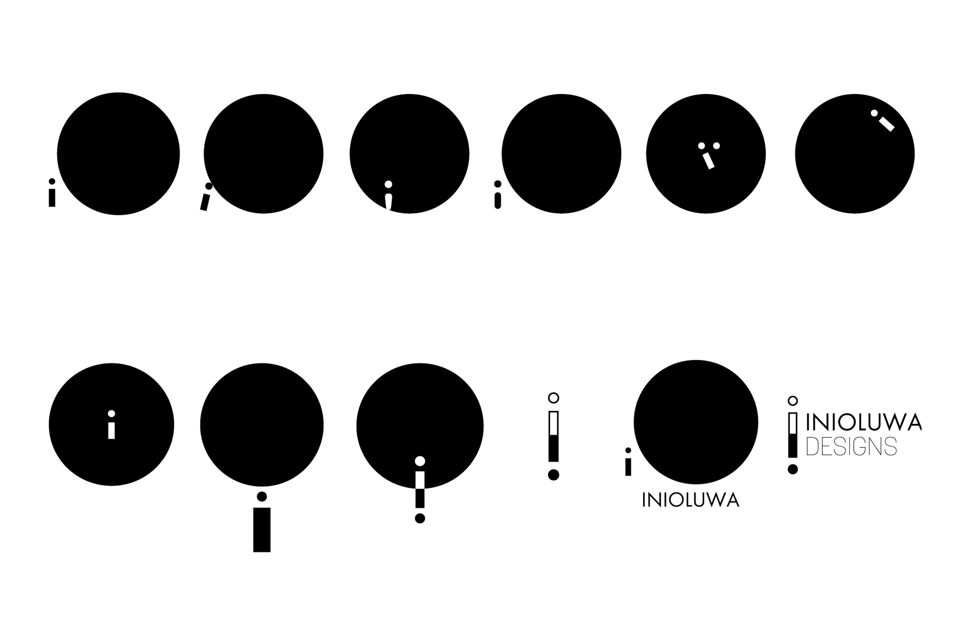
The chosen concept
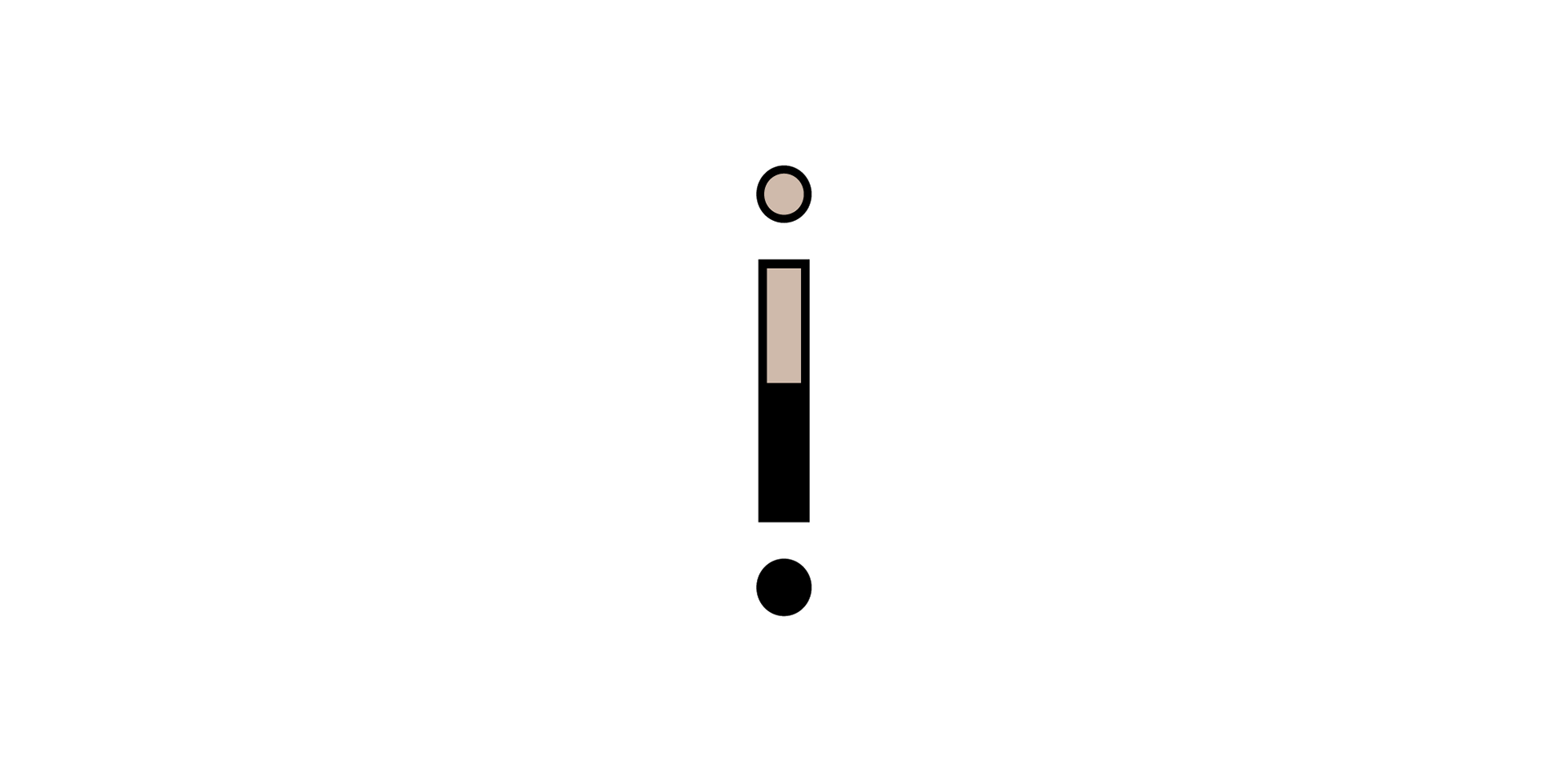
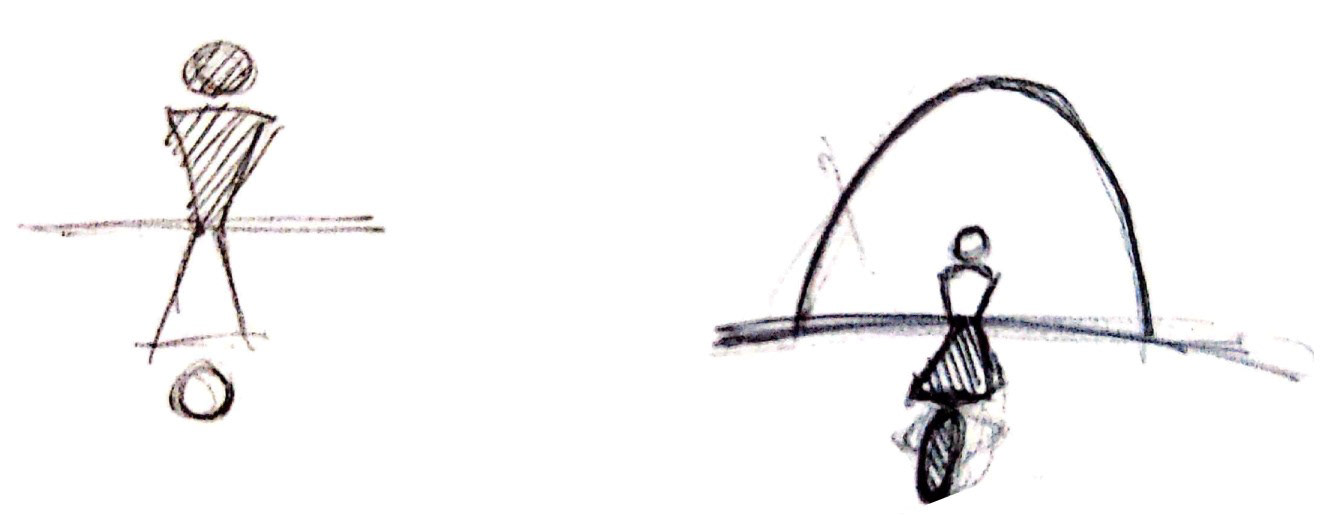
The logo icon evolved from a simple illustration of a figure standing at the entrance to a vast open world. This is symbolic of exploration, curiosity, and the feeling of learning new things. It shows the vastness of knowledge and skill to be potentially acquired in the design field.
This logo is well balanced and symmetrical with the letter ‘i’ and its reflected counterpart, representing a human figure and the two i’s in ‘ini’. The vertical orientation of the logo icon gives it a high quality feel, with the logotypes showing modernity and minimalism.
This logo is well balanced and symmetrical with the letter ‘i’ and its reflected counterpart, representing a human figure and the two i’s in ‘ini’. The vertical orientation of the logo icon gives it a high quality feel, with the logotypes showing modernity and minimalism.


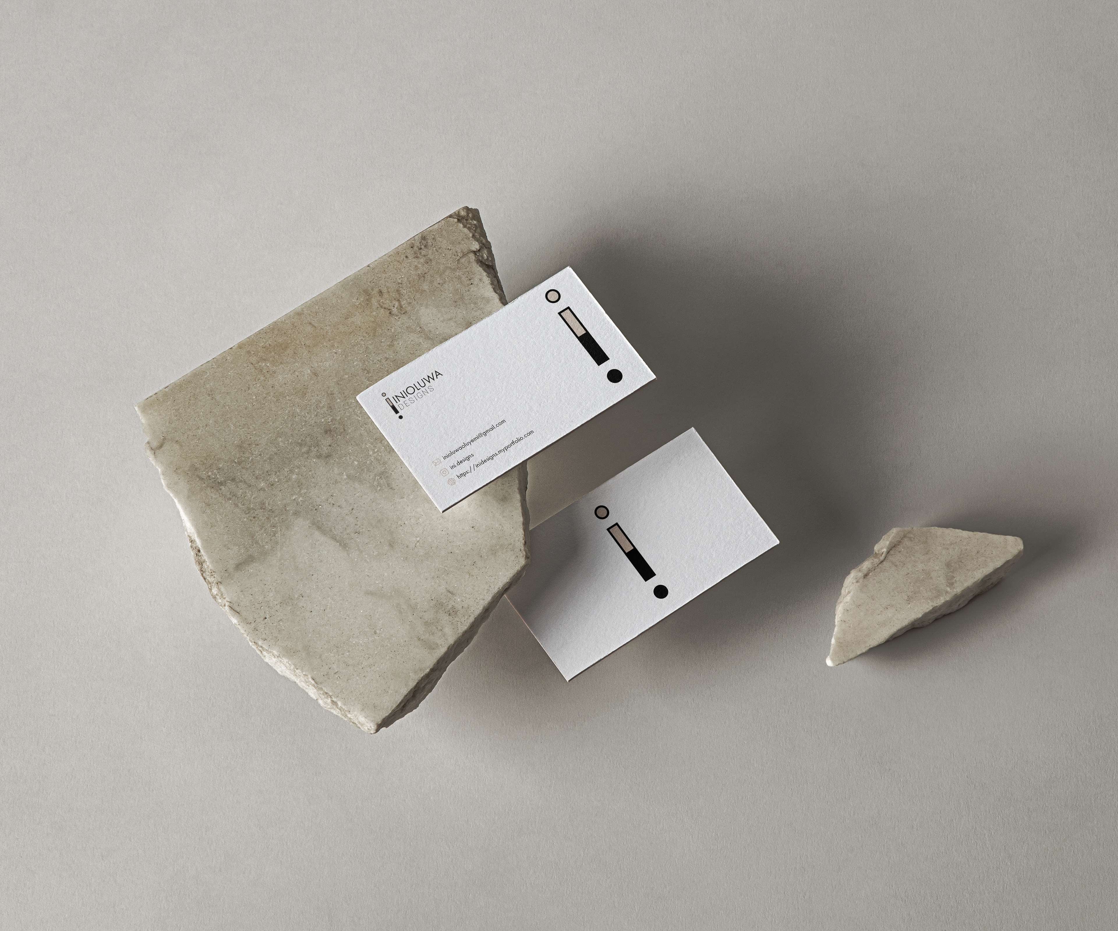
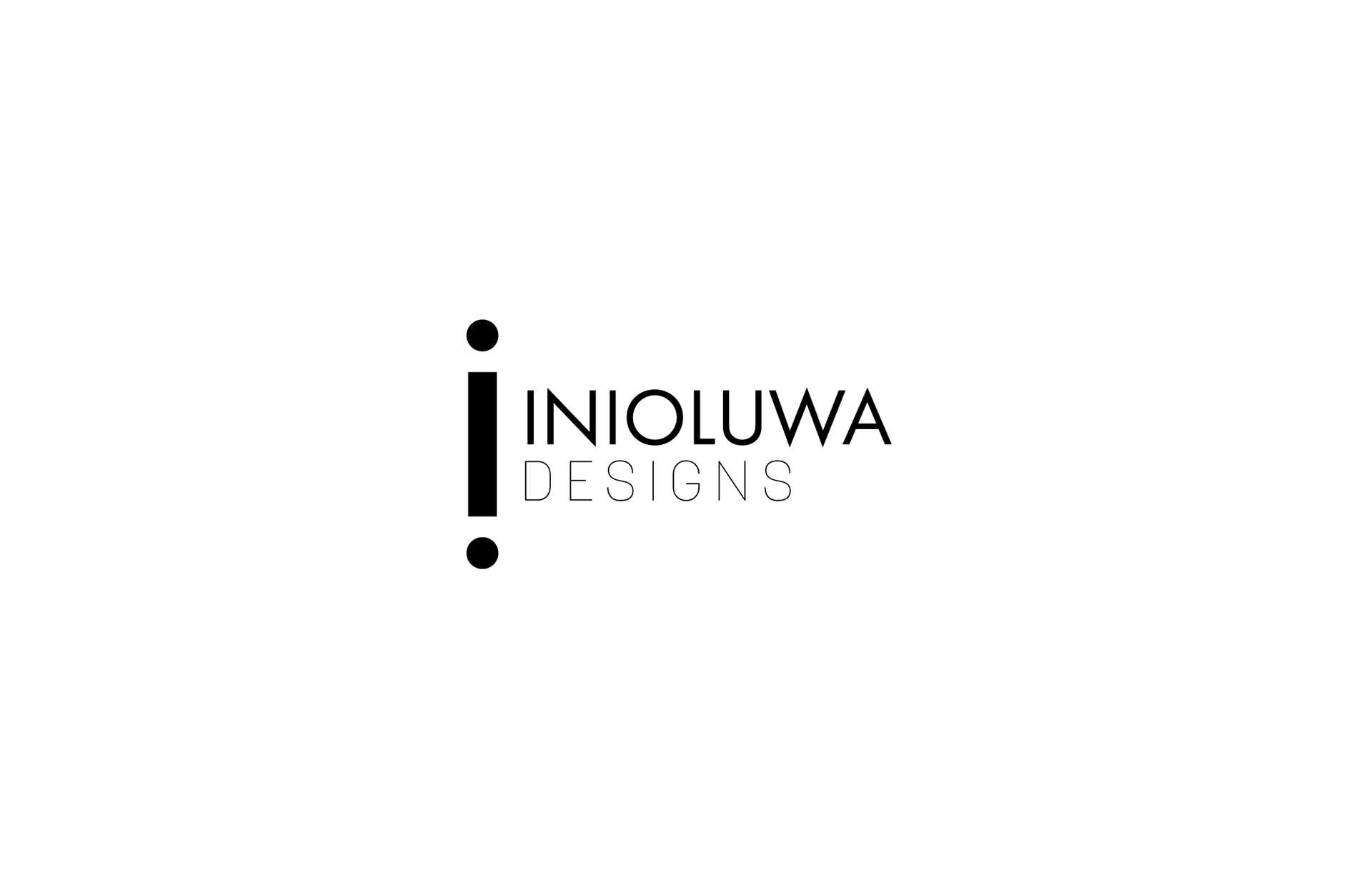
The Final Logo design
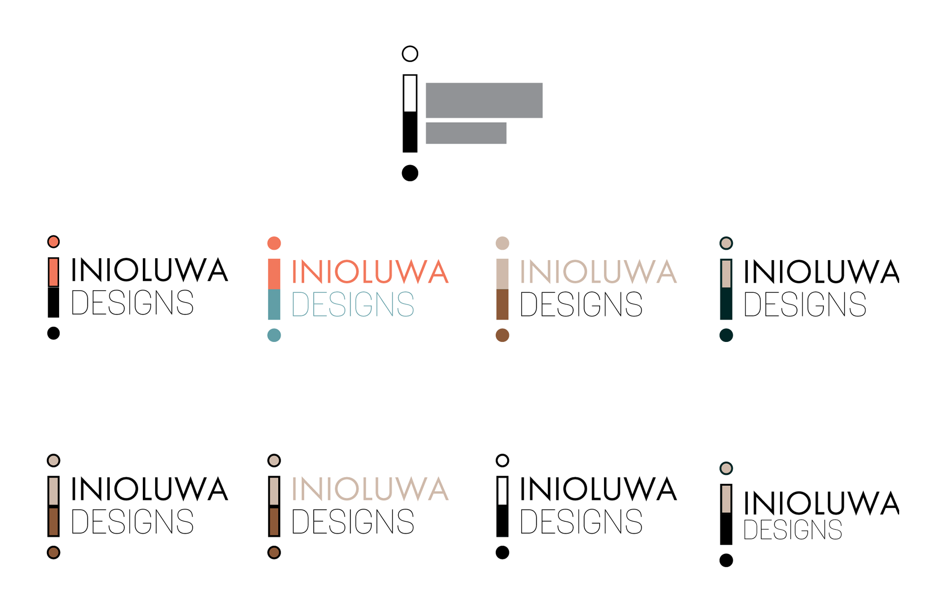
logo variations
The Final logo can be adapted to light and dark backgrounds. The logo's accent color was chosen because it has a warm, muted and earthy tone which is very calming. This is also reminiscent of nature and natural scenery where people tend to be at ease. These traits add to the overall friendliness and quality of the brand.
The fonts chosen are the sans serif fonts Futura PT book and Korolev (thin). These both have a
modern and minimal look, while being very legible. The relatively thin strokes also add elegance to the logo.
modern and minimal look, while being very legible. The relatively thin strokes also add elegance to the logo.
A hierarchy of the words was created using font weight and size, with ‘Inioluwa’ being above
‘designs’ being below.
‘designs’ being below.

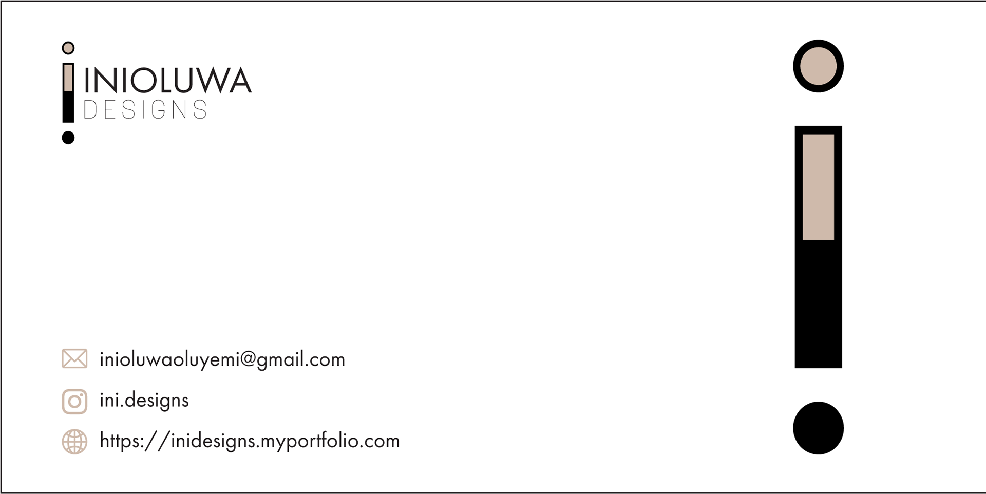
business card design
The business card design is very simple with a clean layout, showing only the necessary information. This
reinforces the personal value of simplicity and minimalism.
reinforces the personal value of simplicity and minimalism.