project summary
This group project required me to work with my peers, in order to create a digital solution for a problem of our choice. We chose to tackle the problem of dissatisfaction caused by the transit system in Ottawa, Ontario.
Project Duration: September- December 2021
Key Skills used: Research, Wireframing, Digital prototyping, Interviews
Key Apps used: Miro, Figma, Illustrator, Indesign
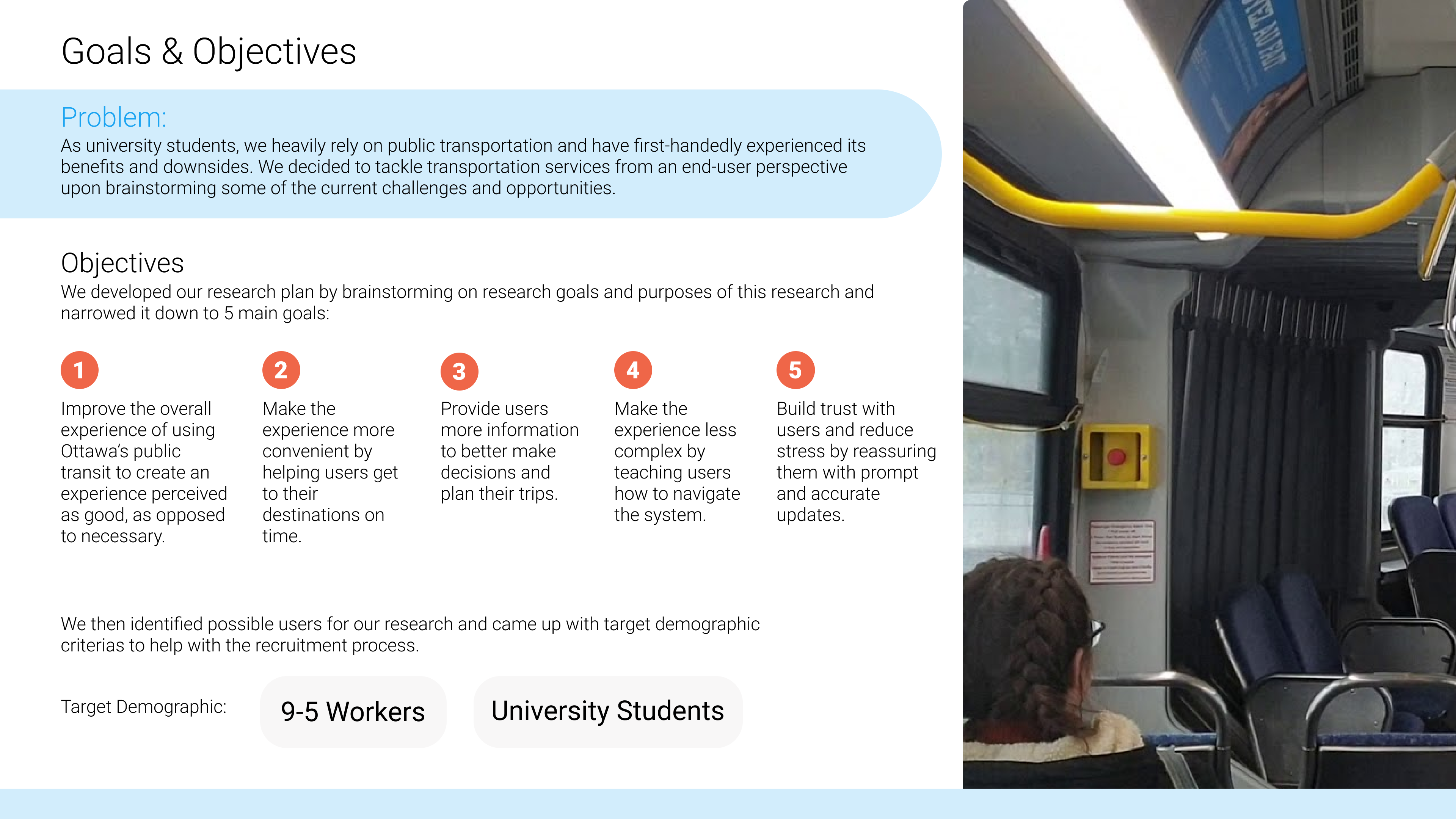
goals and objectives
Before starting the project, goals and objectives had to be determined to properly guide the project and fully define the problem to be solved.
Primary research- Interviews
As a group, we came up with interview questions on different sub-topics, to conduct one-on-one interviews with participants using Zoom.
These questions were made to find out:
- Why they use public transit in Ottawa
- How they use their mobile applications
- How they perceive their overall transit experience currently
- How they plan for their trips
- What challenges they face with their commuting experience using public transit in Ottawa
- What changes could be made to improve their experience.
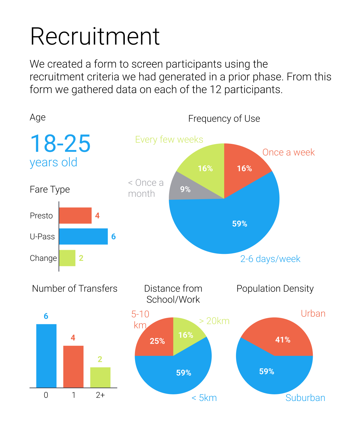
After recruiting and screening participants, we conducted 12 interviews in total.
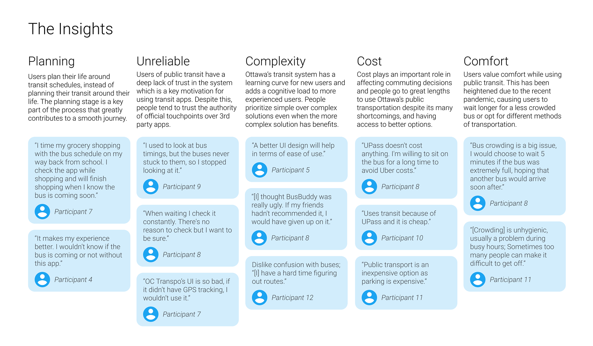
Insights
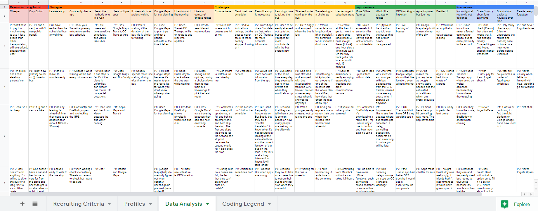
After the interviews had been completed, we analyzed key trends and insights found through out the field work process. We used spreadsheets to better organize participant information and insights by color coding them.
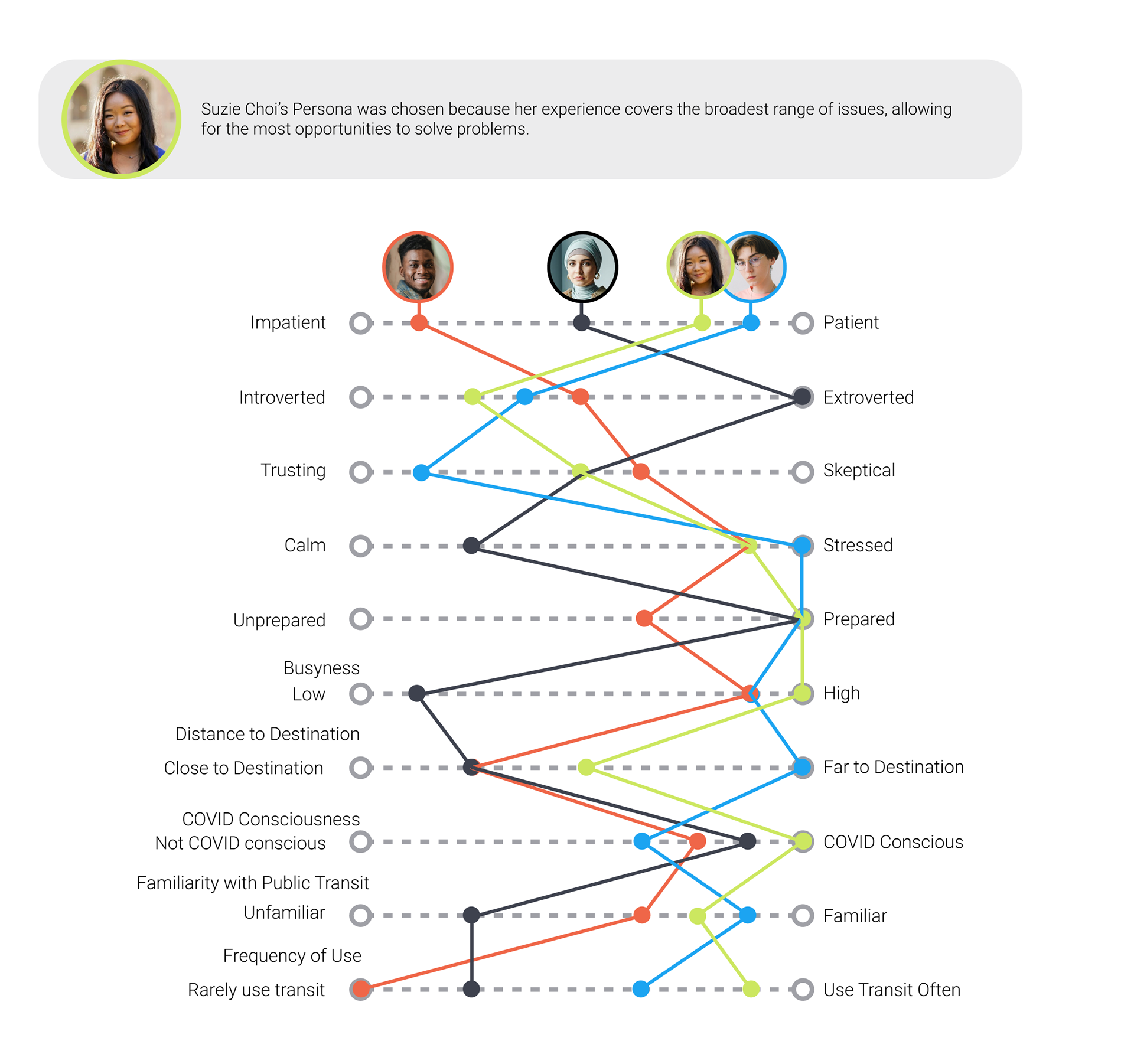
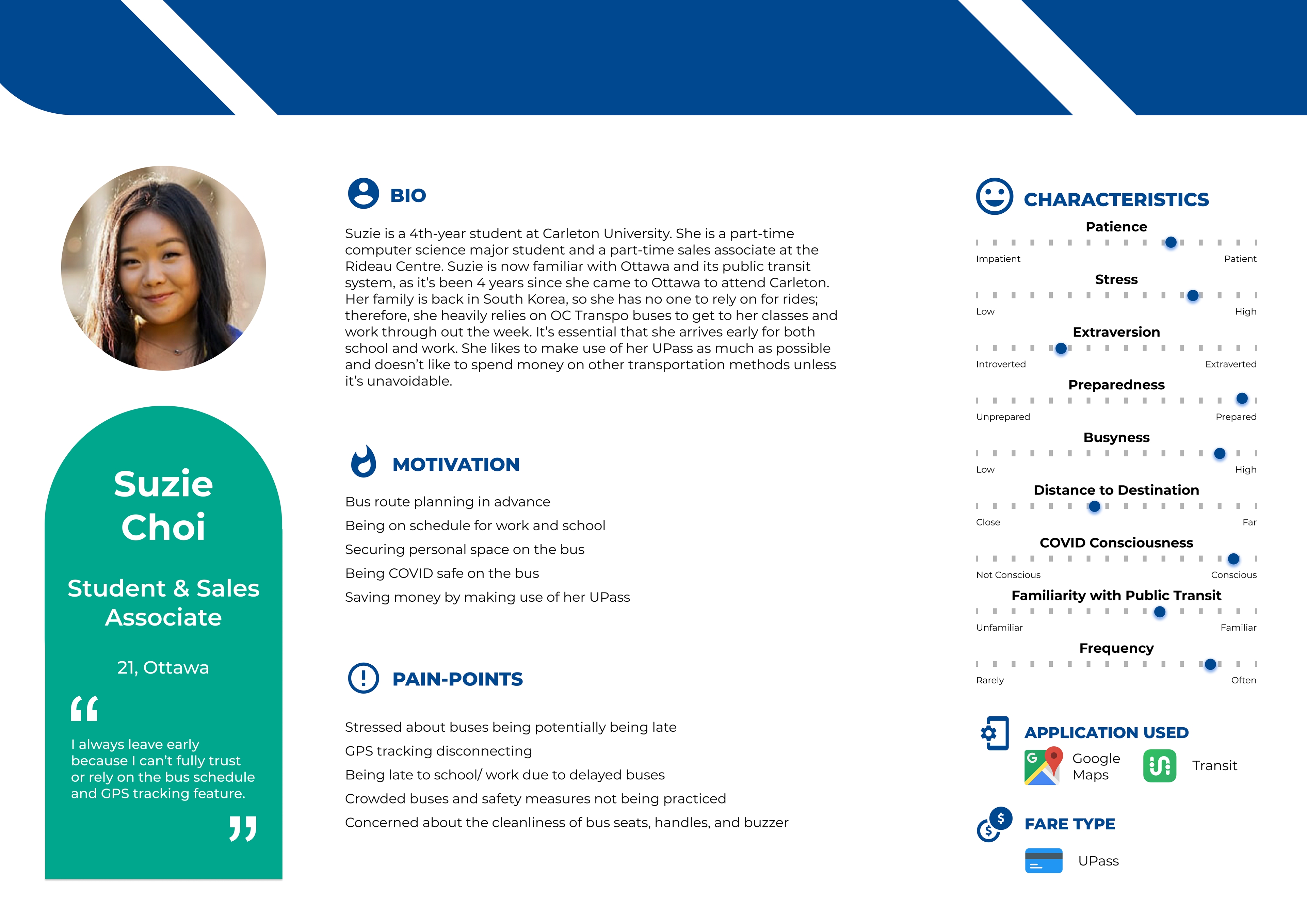
personas
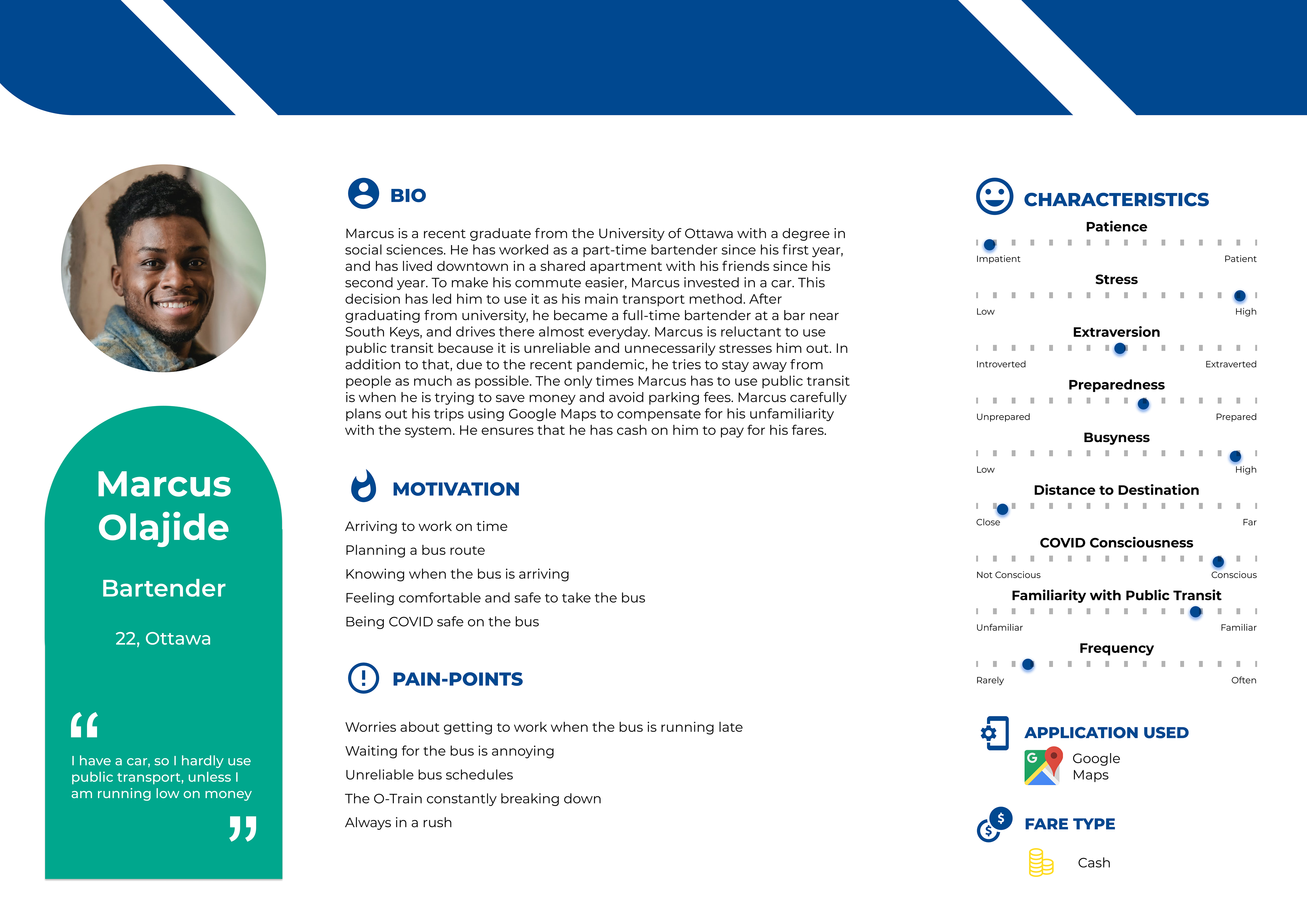
From the interview responses, we were able to create four different personas that represent the various categories of students who interact with Ottawa’s Public Transit. By doing this, we could select a primary persona to design for.
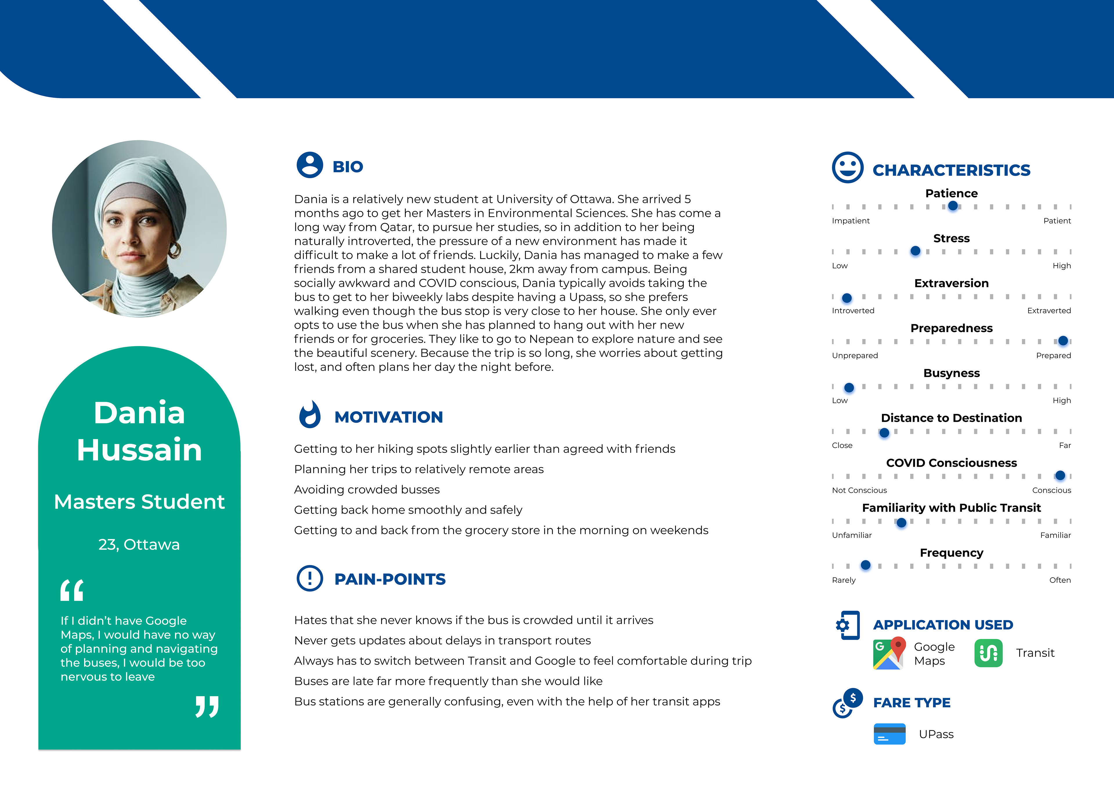

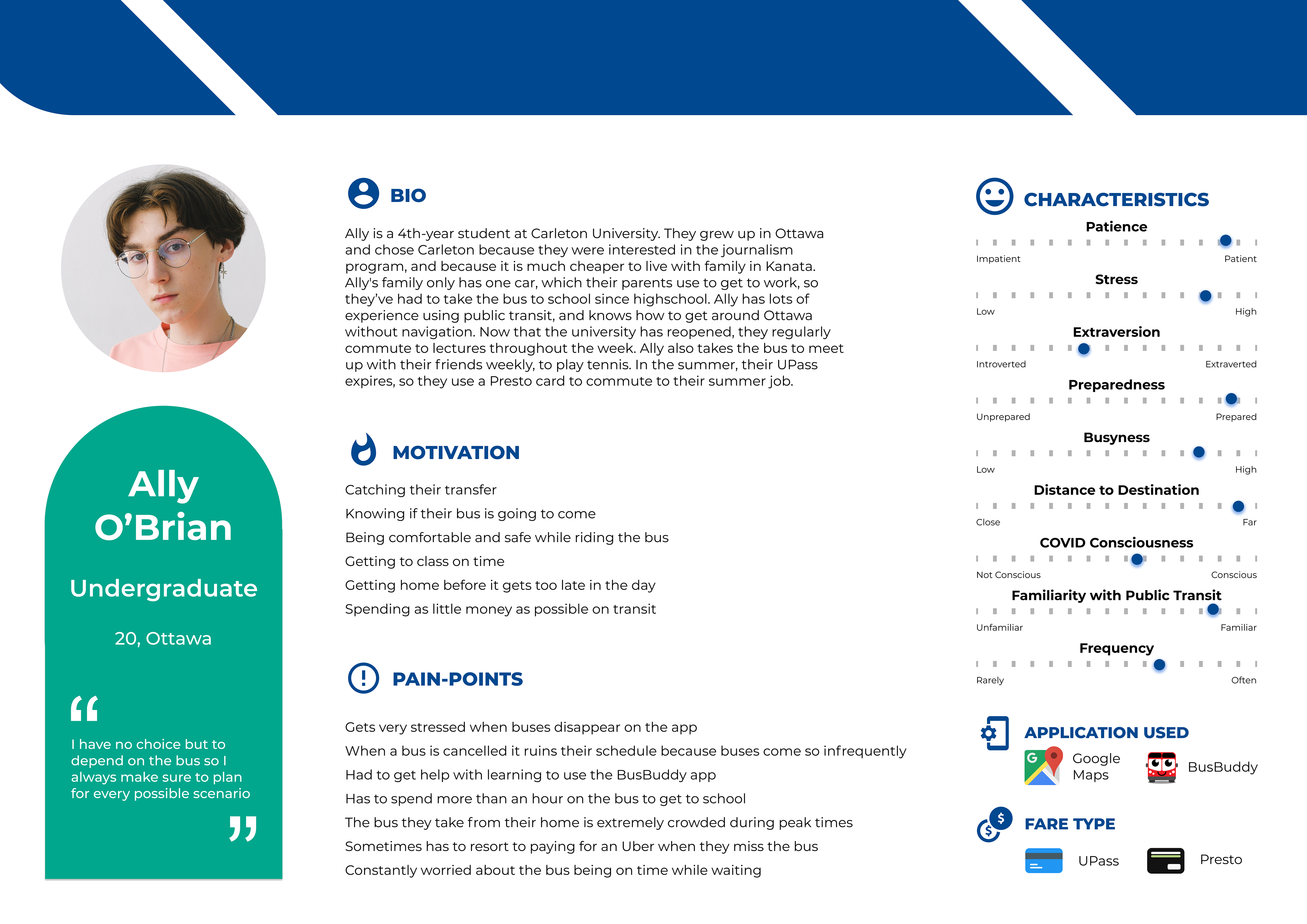
The primary persona chosen was Suzie Choi, as her persona covered the broadest range of issues, and therefore the most opportunities.
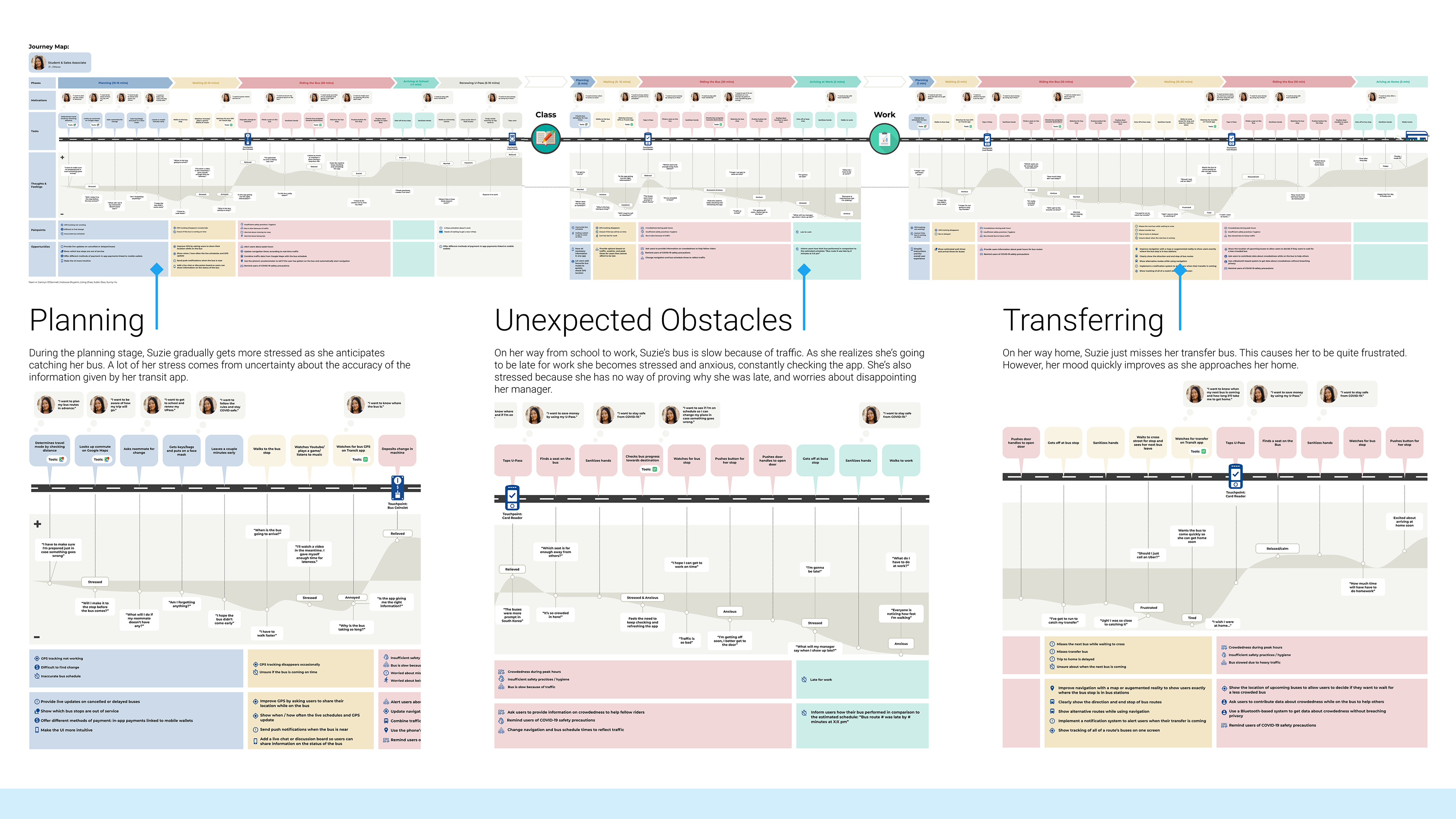
journey map
The journey map was made using data from the perspective of our third persona, Suzie Choi, using a collection of data from our interviews and insights.
By creating the journey map, we were able to easily see where the pain points of the Ottawa transit system were, allowing us to begin to create solutions to these problems.
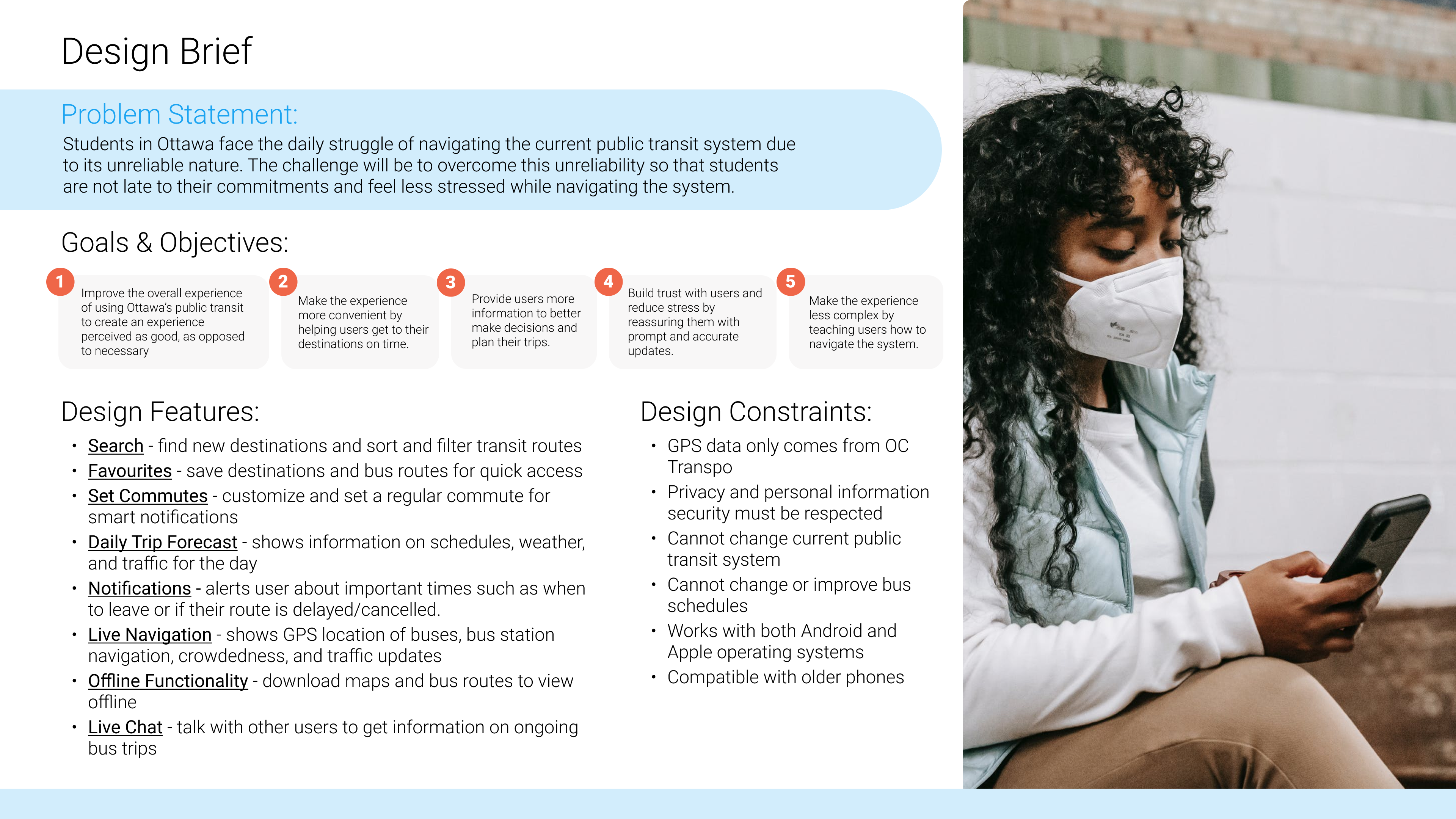
the solution begins
With the problem thoroughly investigated, we could start working on solutions, starting with a design brief to set goals for the product to meet. With objectives defined, the next step was to brainstorm solutions to the various pain points. This was done collaboratively on Miro, and the solutions generated were made into features, as shown below.
information architecture
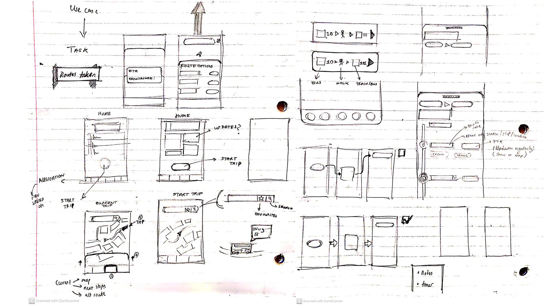
Before the general layout of the app could be decided, the information had to be organized first to have a basic structure to work with. This was done in Miro.
Basic aesthetic ideation was then started with rough sketches of the key screens of the app, along with our initial ideas for implementing the features of the app.

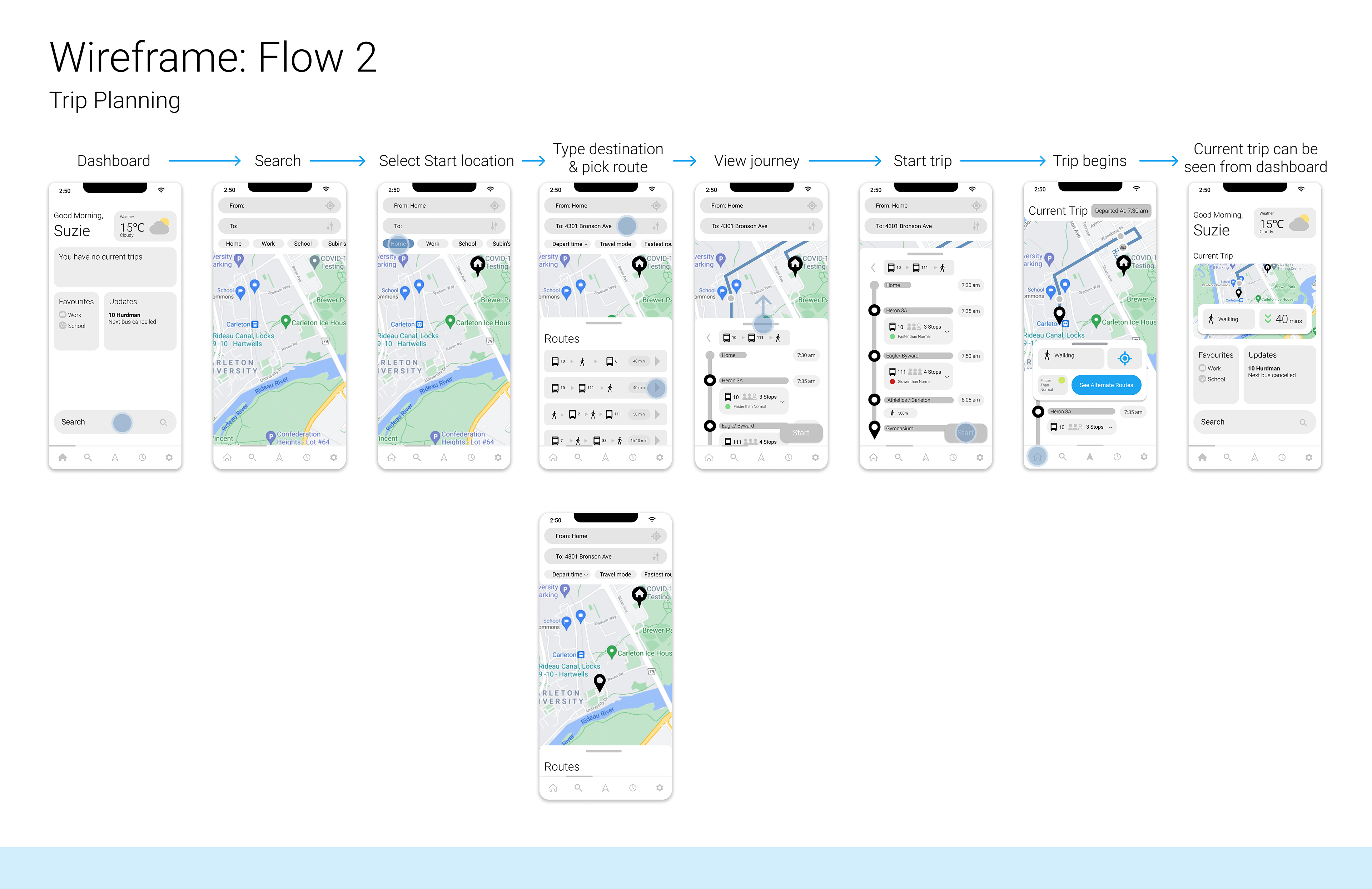
the use cases
Due to the time constraints of this project, it was not possible to design the entire app, so the parts of the app designed were in terms of the use cases/ scenarios of Suzie that we deemed important as a group. These were:
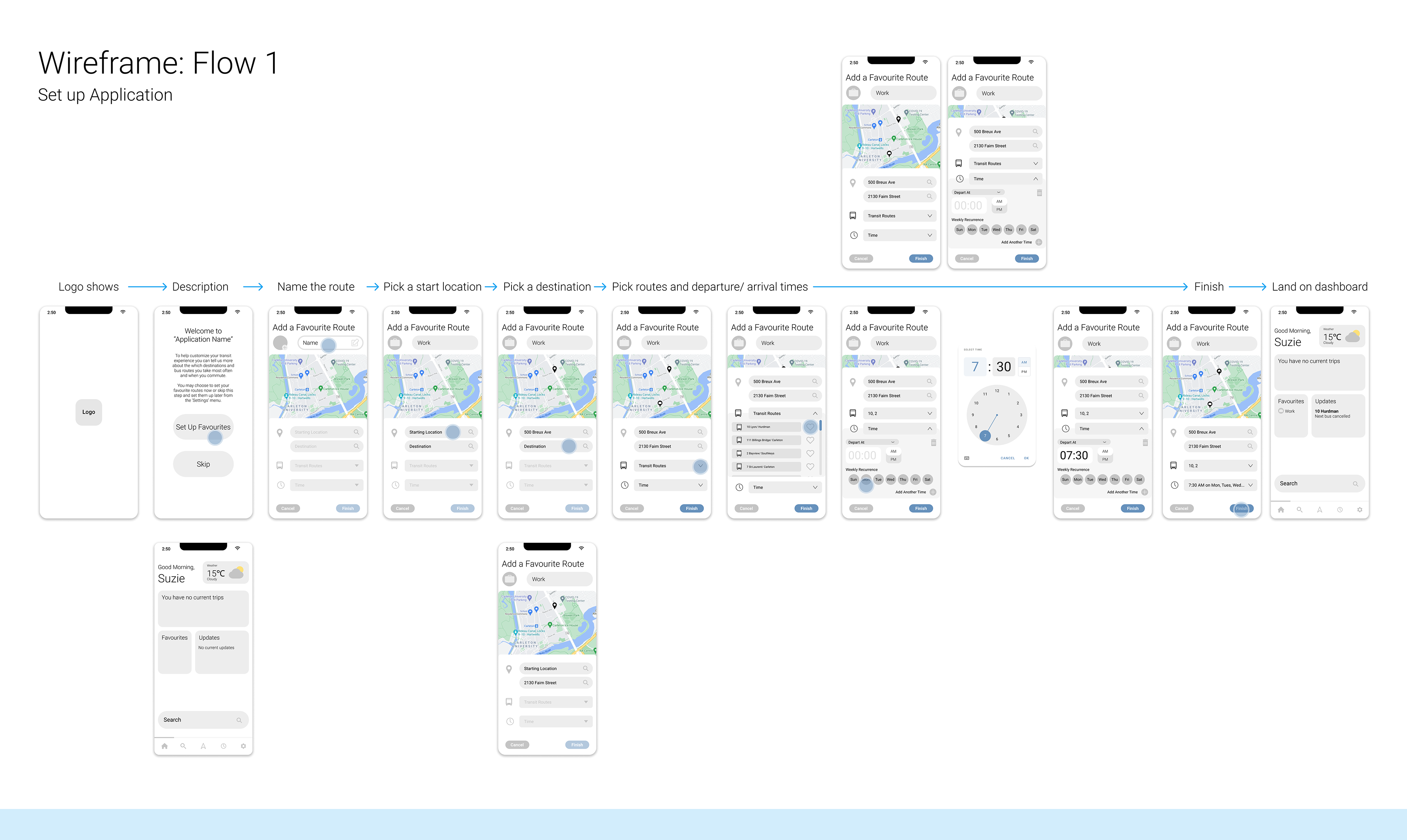
1 - Setting up the application
2 - Planning a new trip
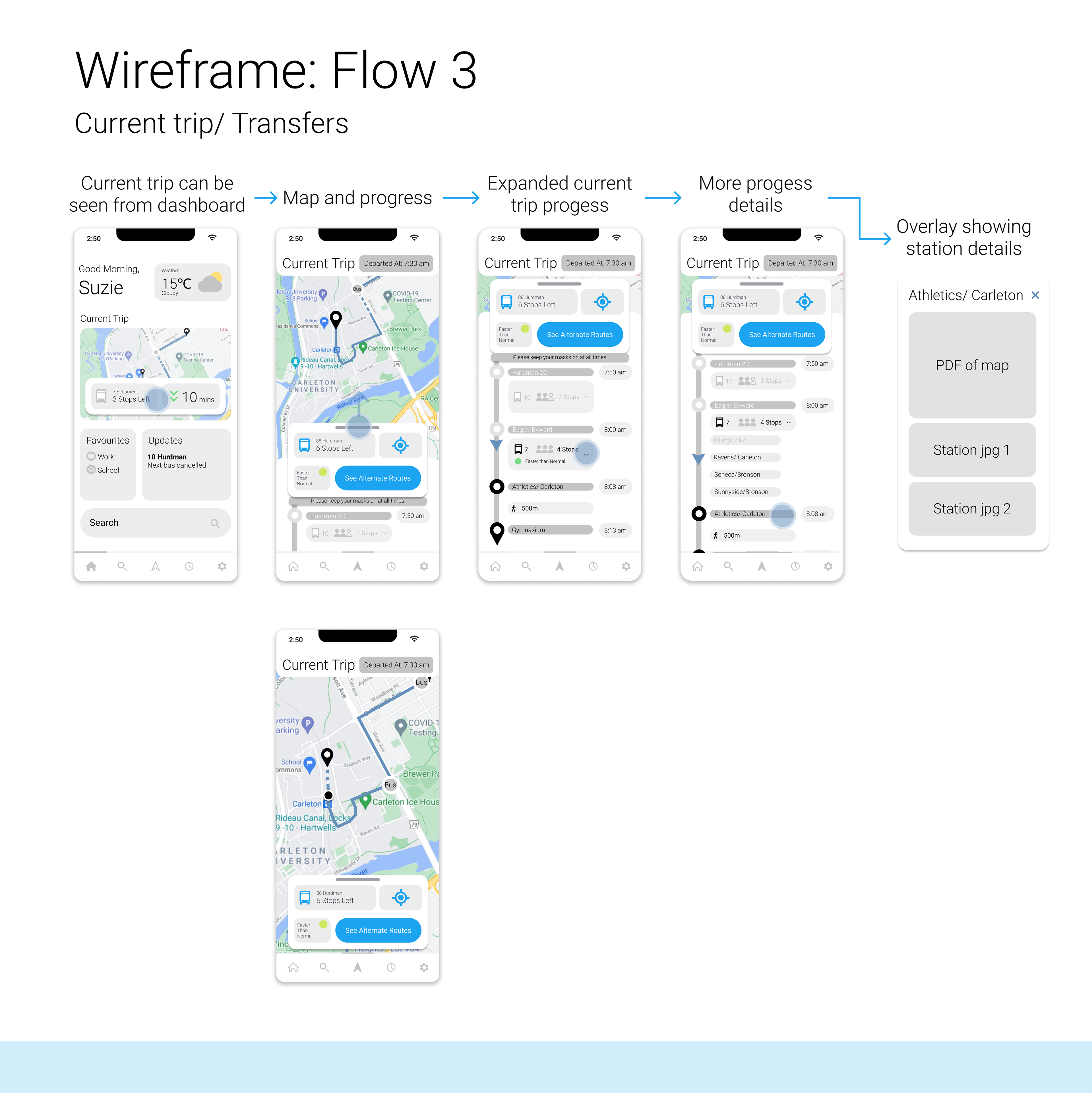
3 - Current trip viewing/ taking transfers during a trip
These use cases were created in Figma
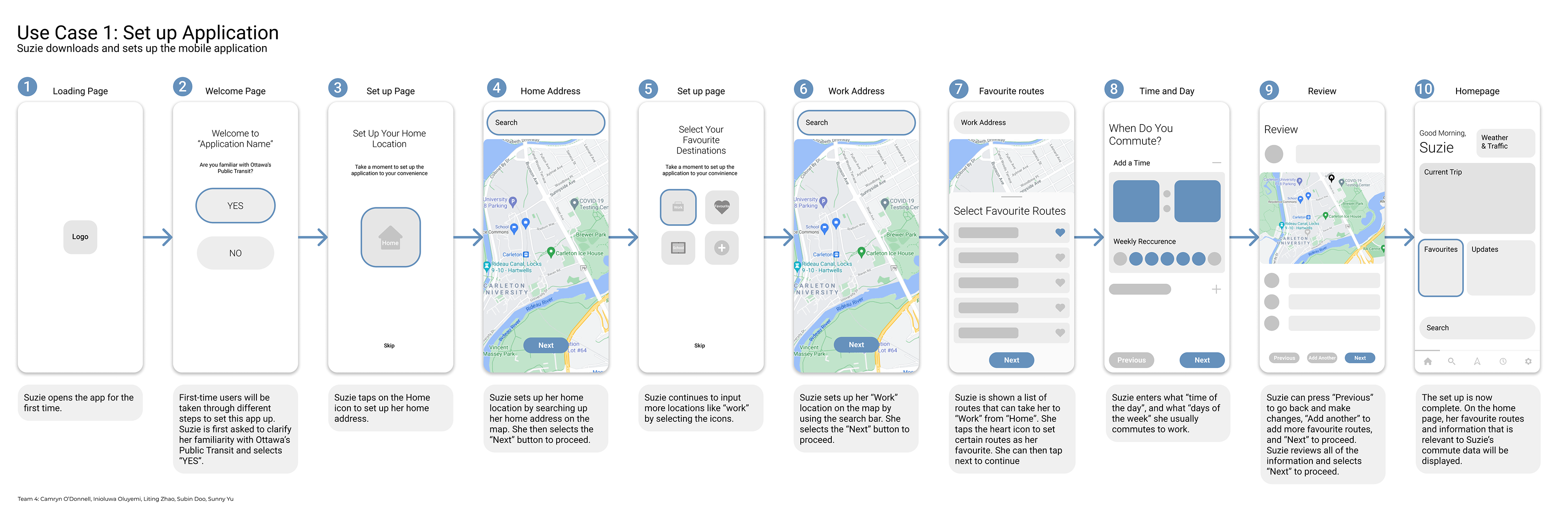
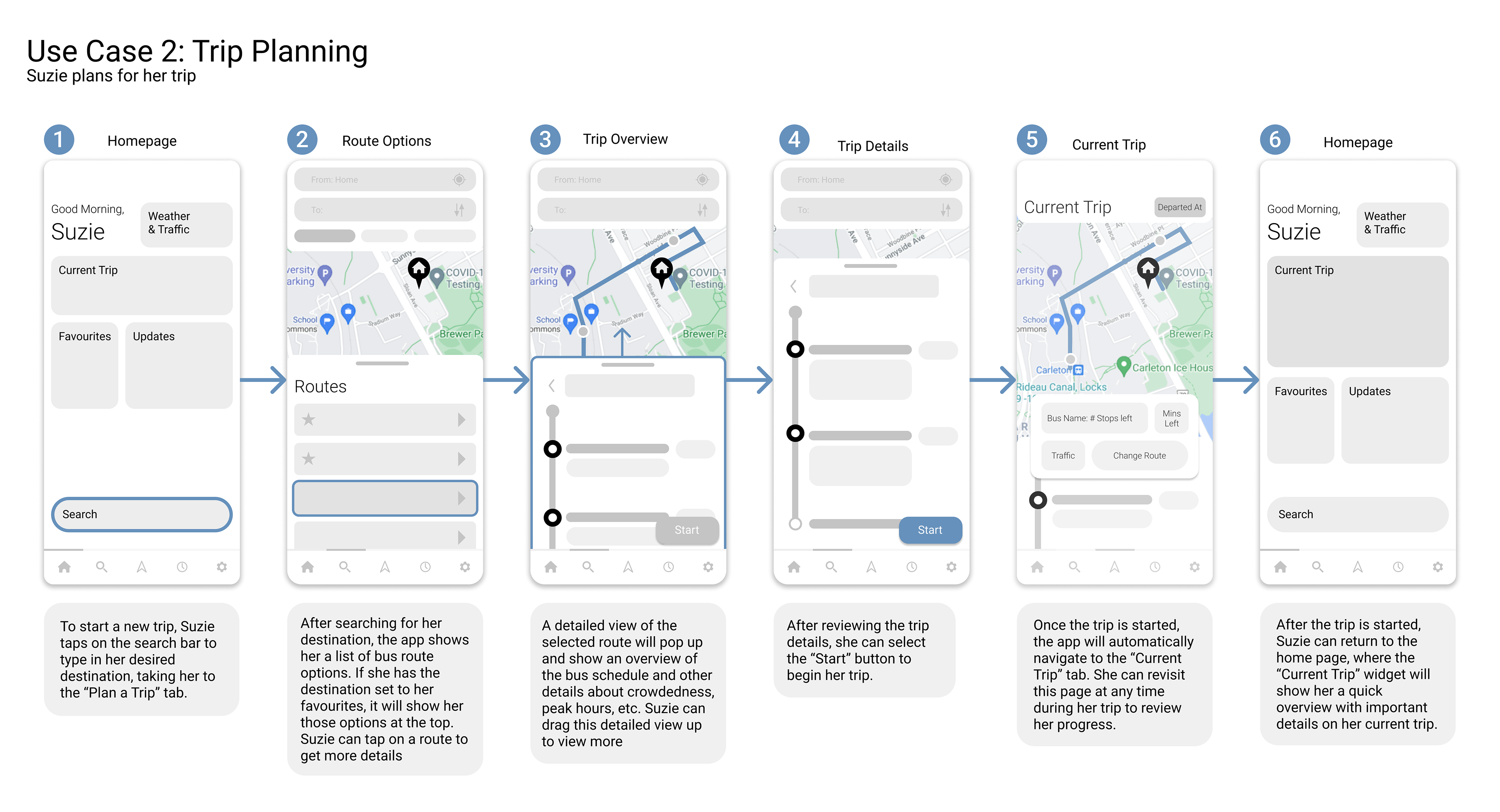
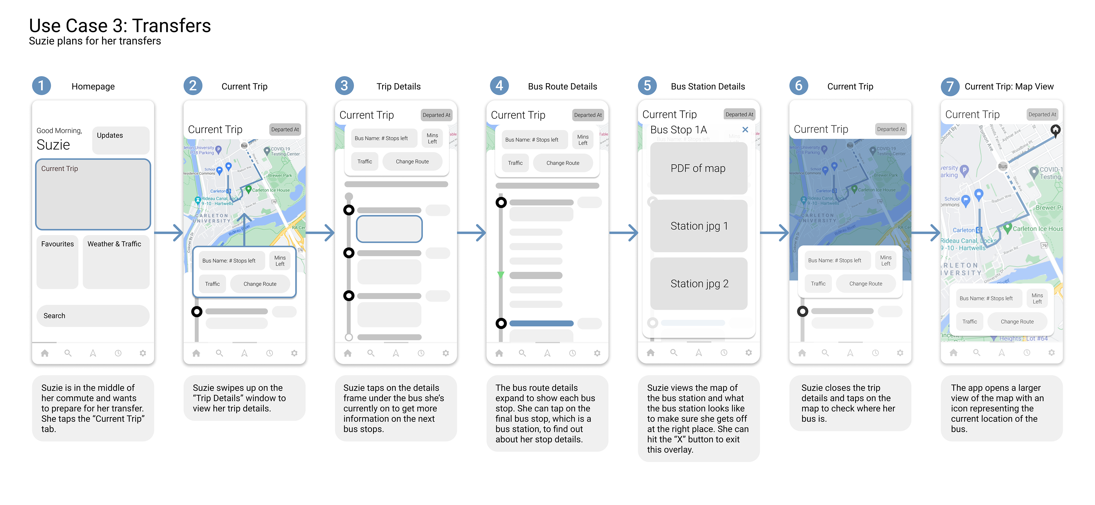
initial wireframes
Once the use cases were developed, we filled in the details and added transition screens to make the prototype more realistic, allowing us to test the app with users. The outlying screens are also transition screens
user testing
After working on user flows and wireframes, the next step was to test our prototype application with real students using Figma.
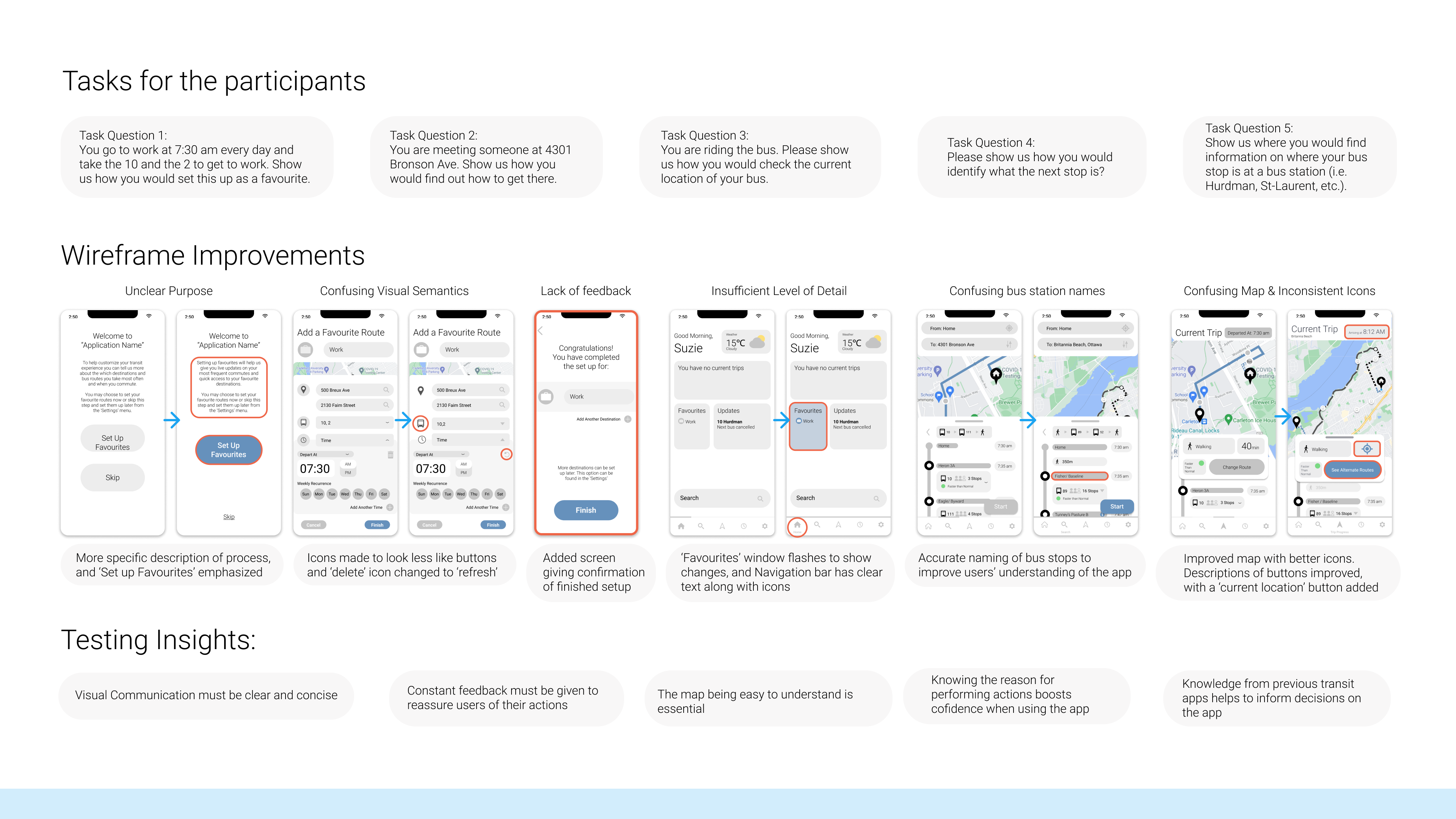
This process was started by generating 5 tasks for the participants to perform, testing key features of the app.
This process was started by generating 5 tasks for the participants to perform, testing key features of the app.
The testing process allowed us to take feedback from the participants, and generate more insights, which helped to inform the improvements made to the wireframes for the different use scenarios.
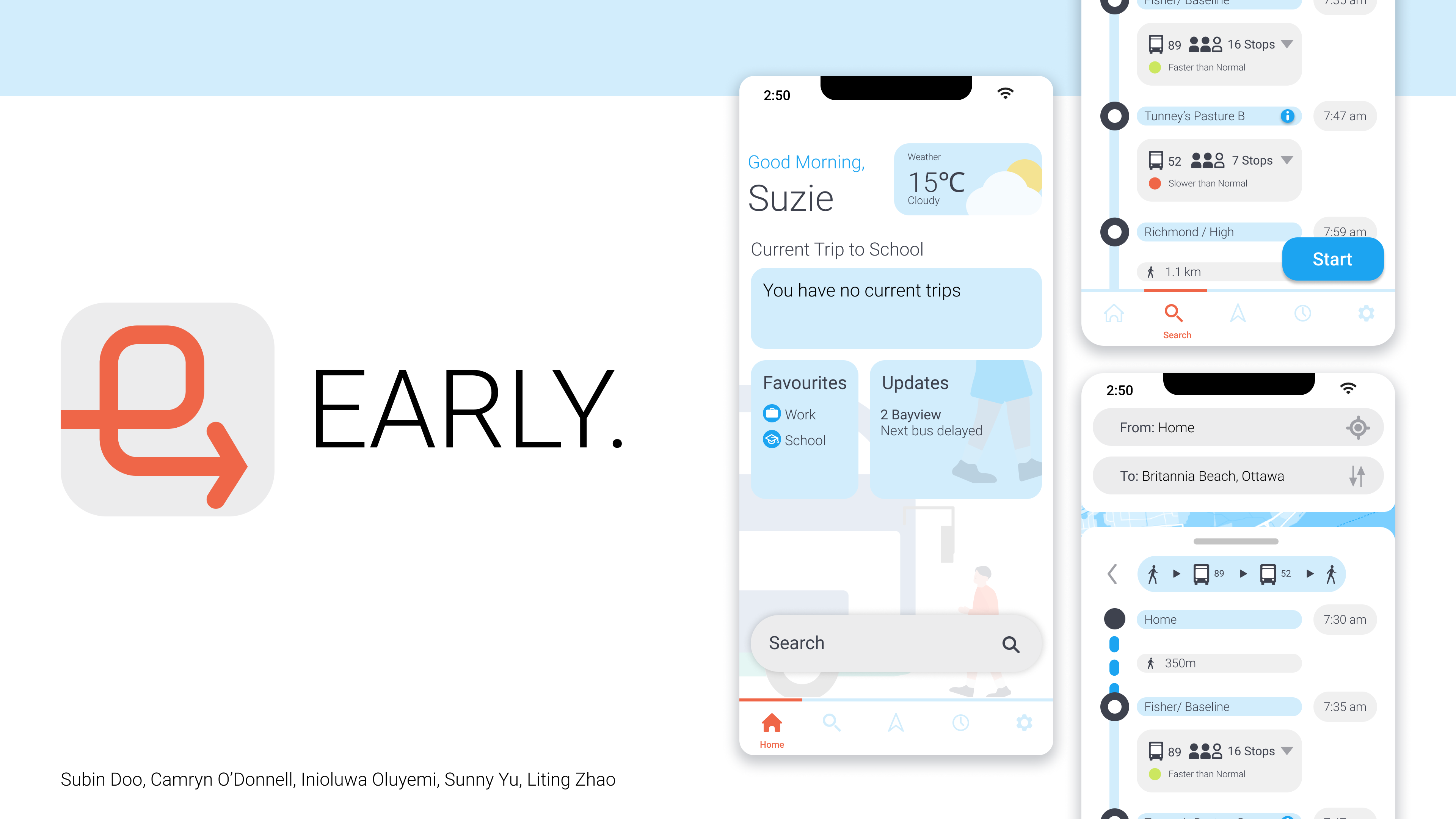
branding
With the features improved upon as much as time allowed, it was time to move to the aesthetics and branding phase to give the app the desired look and feel.
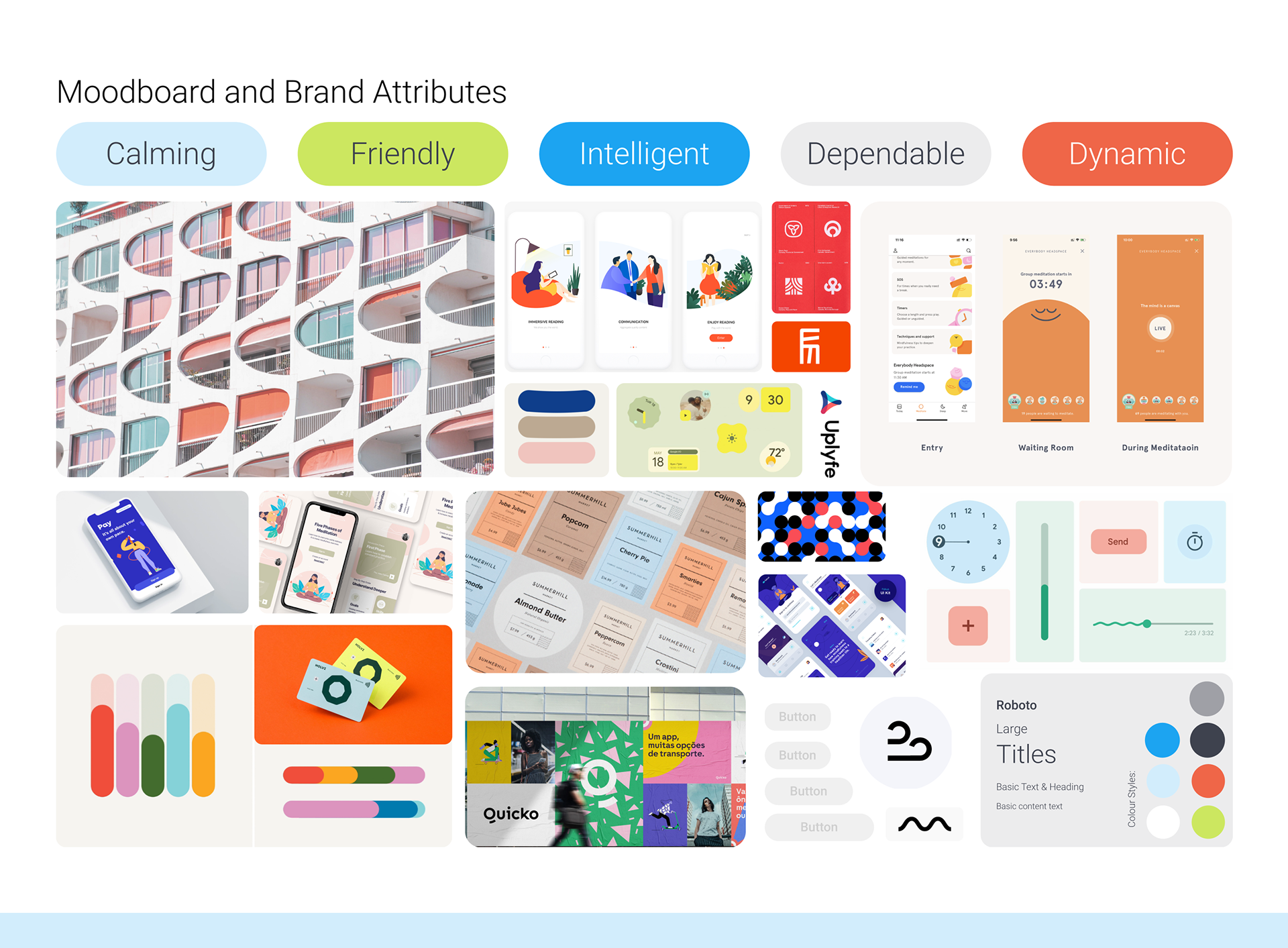
A mood board was created to help us decide on a look that matched the feelings of our identified brand values. This allowed us to decide on main theme and brand colours.
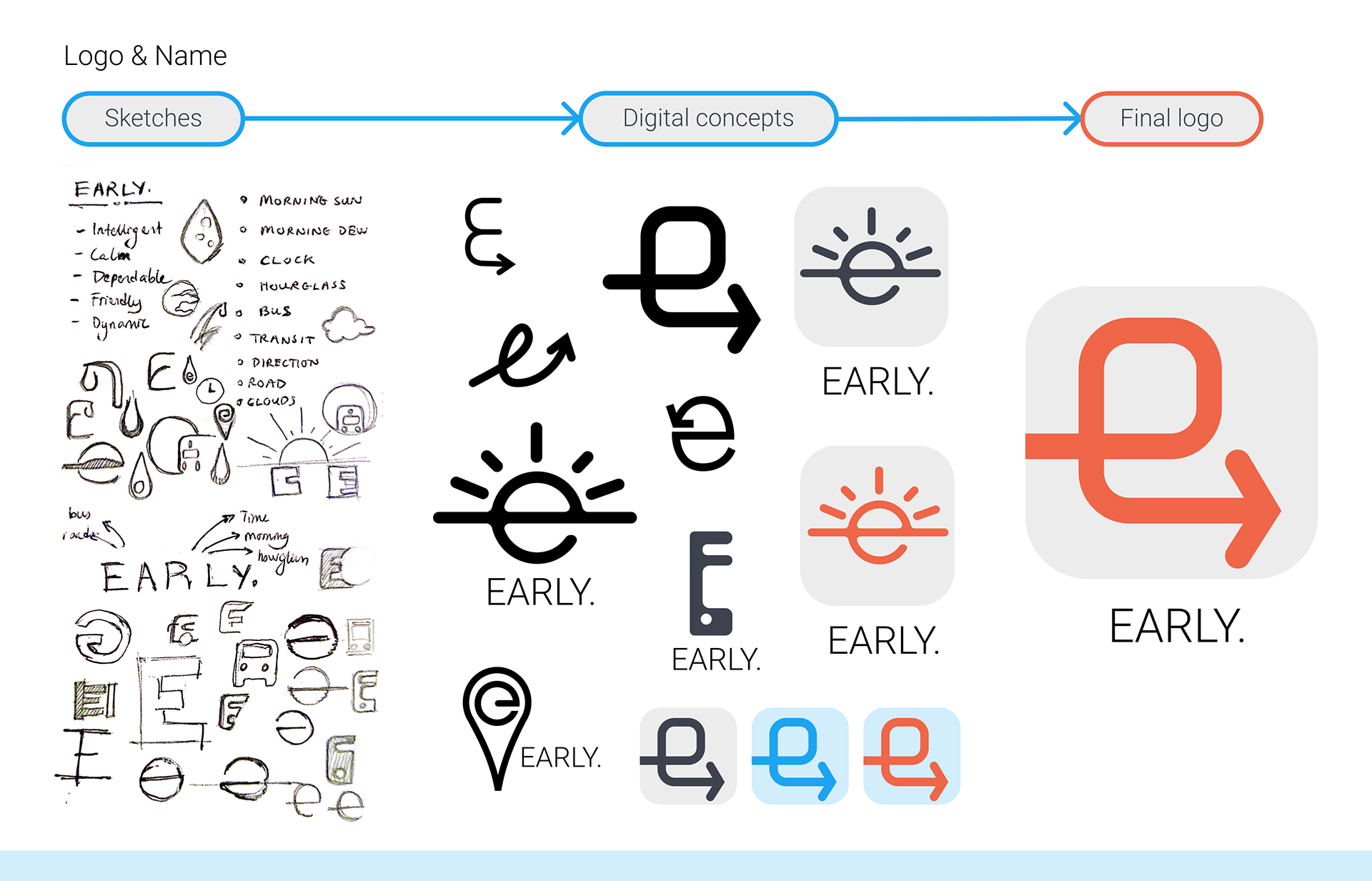
The logo was created from an arrow that forms an 'e', relating to the brand name, and depicting motion.
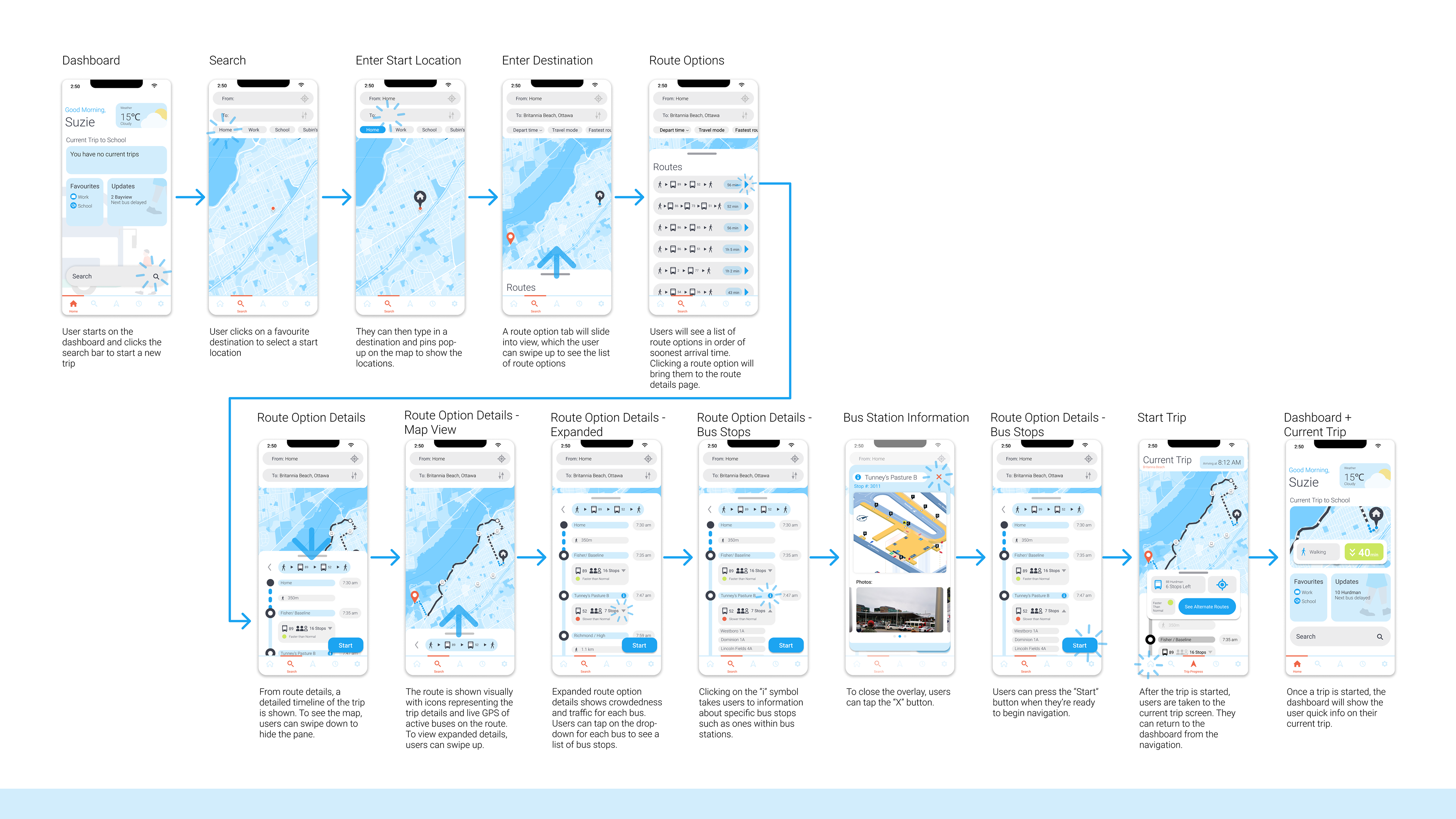
final screens (for user flow 2)
With the branding as complete as it could be in the given time period, the next step was to apply it to one of the user flows. The chosen user flow was Planning a trip.
A standout feature of this app is the ability to view bus station information such as a map of the station, even while on a trip. This feature was created after a few participants had identified confusion with navigating Ottawa bus stations as a contributor to their stress during trips.
improvements
- Getting access to more diverse transit user groups other than just students would have helped to build a solution that would potentially reach a wider market. The target market would not be limited to just students.
- Putting more time into the look and feel of the app could make for a more appealing interface that better aligns with the brand values identified
